PROJECT WORKFLOW
Our methodology for analyzing air quality across Greece follows a structured pipeline from multi-source data acquisition to WebGIS-based visualization and interpretation.
1. DATA COLLECTION
Multiple datasets were collected to support a comprehensive analysis:
- Air Quality Monitoring Data: Monthly reanalysis data (2013–2022) for NO₂, PM₂.5, PM₁₀ from the CAMS European Air Quality Reanalysis dataset.
-
Land Cover Data:
ESA CCI Land Cover dataset (2022), classified and
later reclassified to IPCC classes.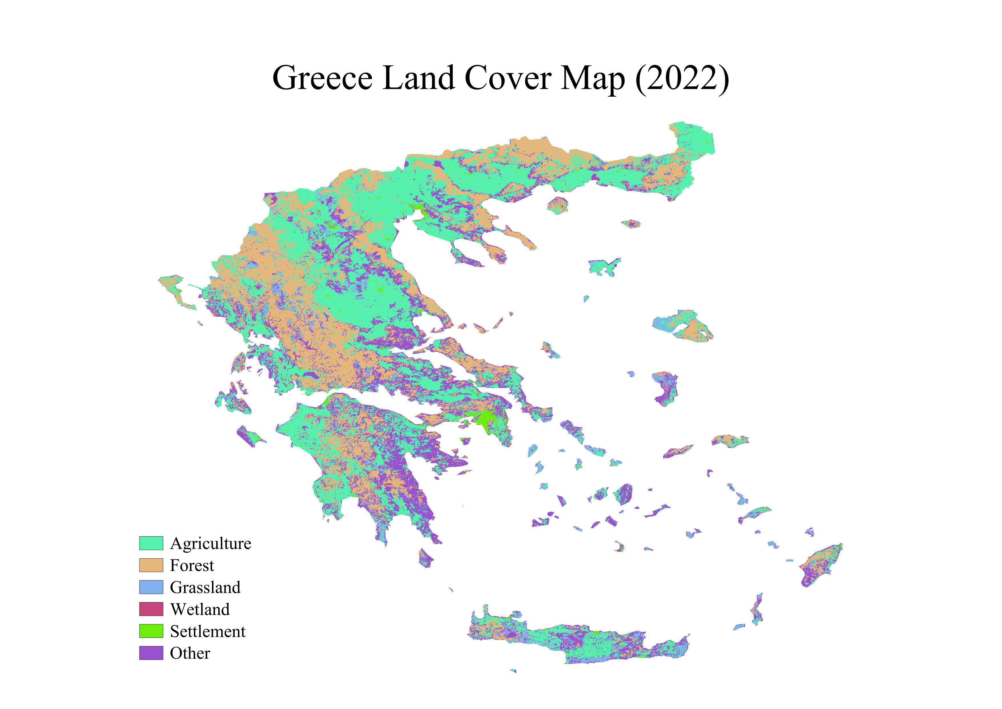
-
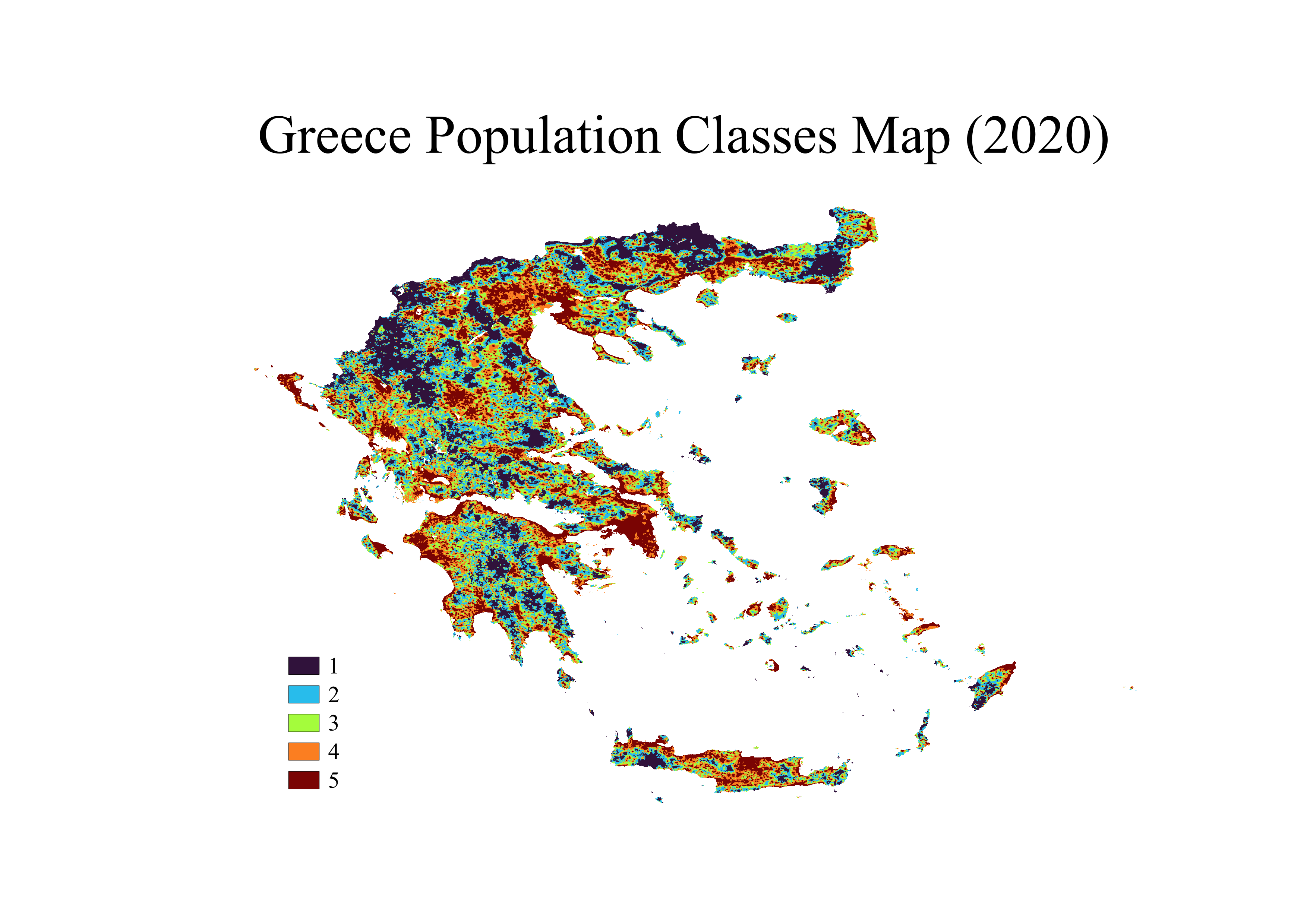
Population Data:
2020 population counts from WorldPop,
used to assess exposure. -
Administrative Boundaries:
GAUL Level 2 (e.g., provinces) shapefile to
support zonal and bivariate statistics.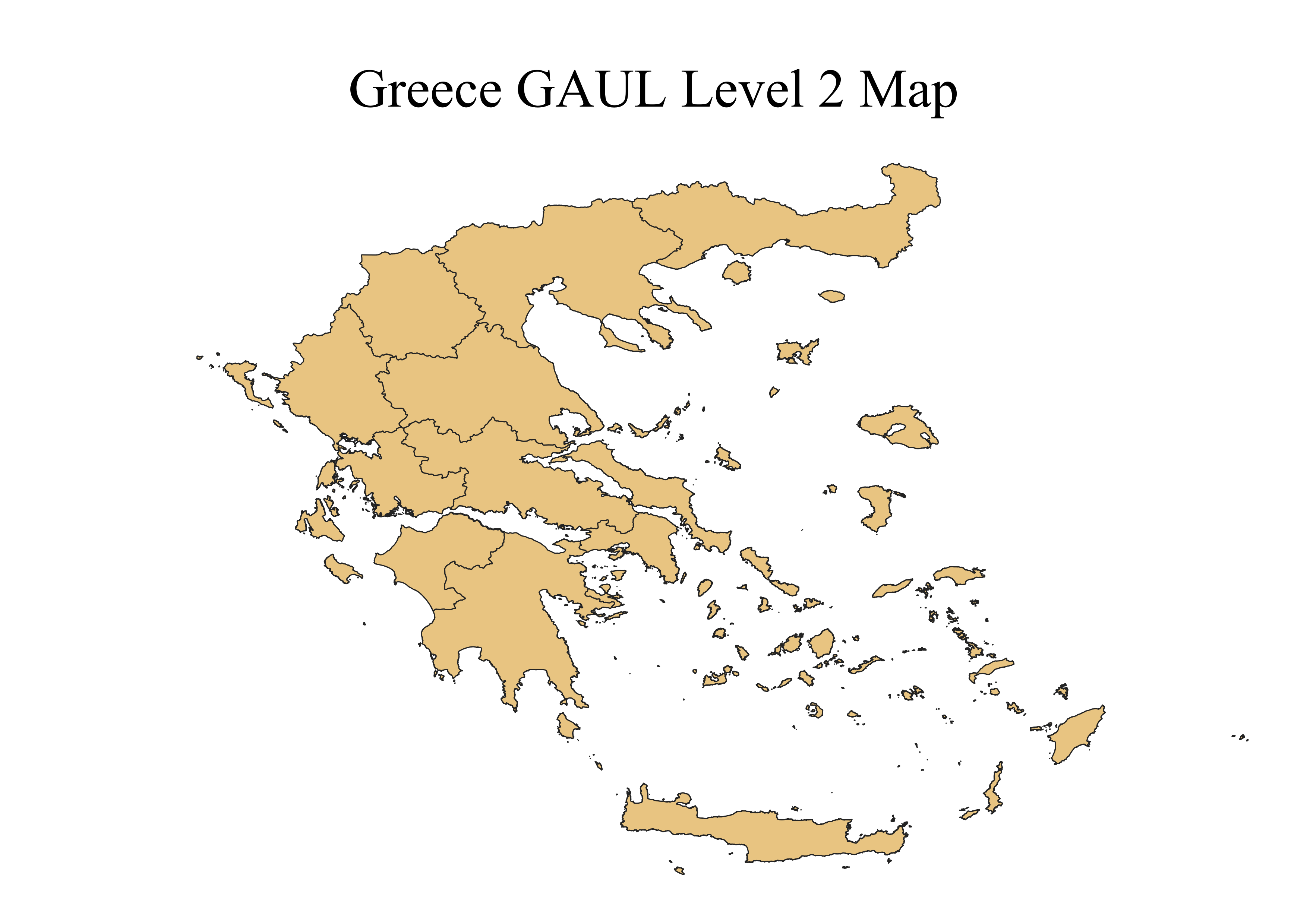
2. DATA PROCESSING AND INTEGRATION
Preprocessing steps:
-
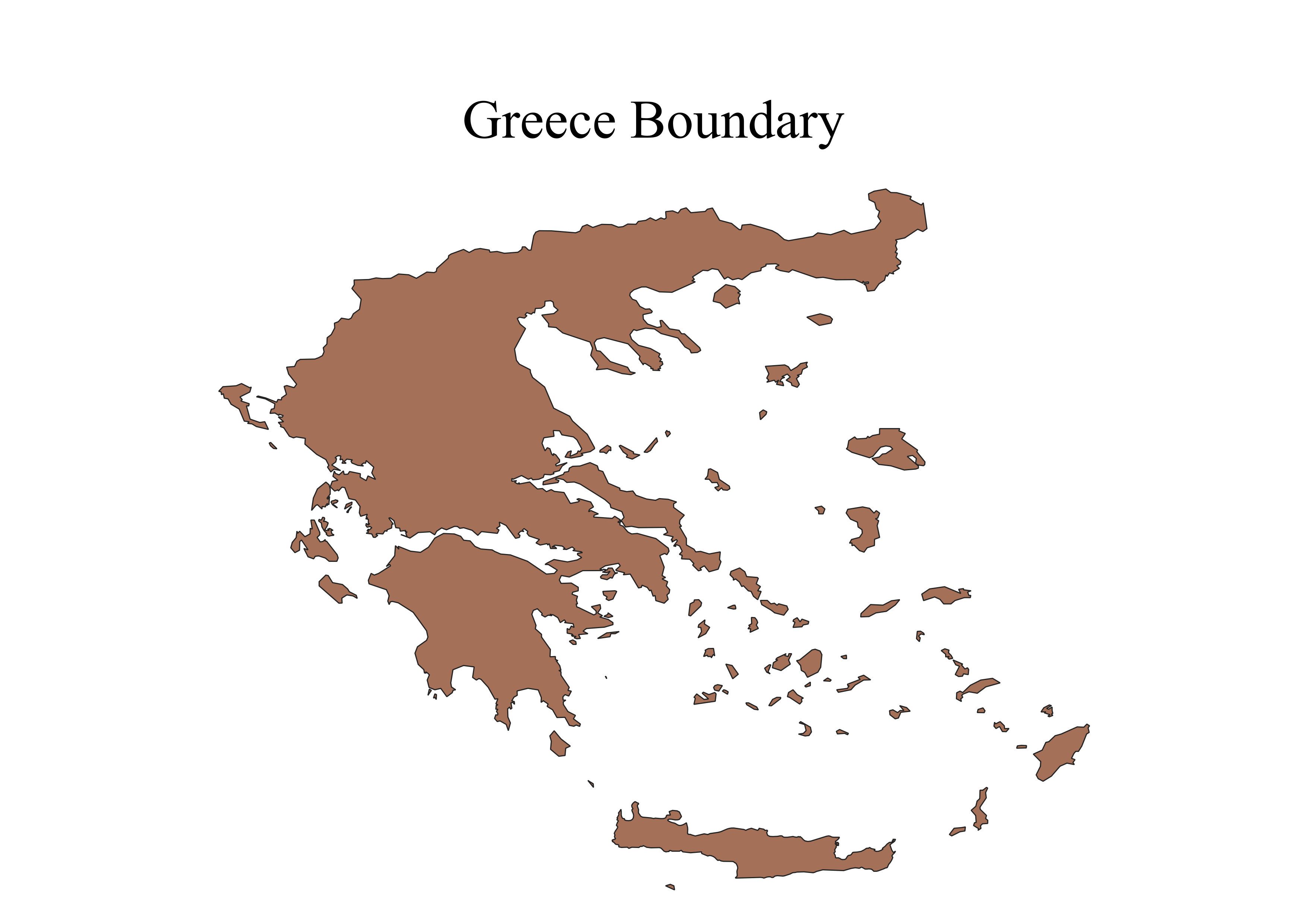
Clipping: All raster and vector datasets were clipped to Greece’s boundary to optimize processing.
- Projection: Unified CRS (WGS84 EPSG:4326) was applied to all datasets.
- NetCDF Handling: December 2022 data was downloaded and processed manually from raw CAMS NetCDF files, then aggregated into monthly means using QGIS mesh tools.
- Raster Aggregation:
- Monthly to yearly average pollutant maps (2013–2022).
- Reclassification of 2020 maps based on EU pollutant thresholds.
- Computation of 2022 deviations from the 2017–2021 mean using Raster Calculator.
3. SPATIAL ANALYSIS AND MODELING
Key analysis steps:
- Land Cover Reclassification: ESA CCI LC 2022 was reclassified to 11 IPCC classes using a reclassification table.
- Zonal Statistics (Built-Up Areas): Extracted and dissolved urban zones for focused pollutant time-series stats (2013–2022).
- Pollution Trend Analysis: Plotted NO₂/PM₂.5/PM₁₀ annual trends and extremes across land cover classes using joined zonal data.
- Population Exposure Classes: WorldPop raster was reclassified into 5 quantile-based population classes via r.quantiles and Reclassify by table.
4. EXPOSURE AND RISK ASSESSMENT
We evaluated exposure through:
- Pollution Class Maps: Classified 2020 pollution maps using EU thresholds.
- Bivariate Mapping: Combined 5 pollution levels × 5 population classes into a 25-class bivariate attribute, rendered with pre-defined QML style.
- Pie Chart Representation: Dissolved bivariate zones by pollution class, computed population sums, and visualized exposure via pie charts using DataPlotly.
5. WEBGIS IMPLEMENTATION
Interactive visualization was implemented through:
- GeoServer Configuration: All raster and vector outputs published via WMS/WFS.
- Layer Styling: Styled maps using .sld files including bivariate and classification symbology.
- WebGIS & Website: Integrated using OpenLayers + HTML/CSS/JS; bivariate legends and pie charts embedded to support user interpretation.
6. VALIDATION AND QUALITY CONTROL
- Interpolation Validation: Cross-checks between annual averages and known seasonal peaks.
- Comparative Benchmarking: Used both EU and WHO threshold schemes for classification robustness.
- Expert Review: Methodology aligned with lab guidance and project goals.
- Uncertainty Consideration: Year-on-year deviation maps supported anomaly detection.